Edwards
 Aka: Brian Silver
Posts: 3,037
|
Post by Edwards on May 25, 2007 21:05:54 GMT -5
Rules- Size
- Width: 200-400
- Height:100-200
- Theme: Naruto
- Text: Optional
- Stocks: Si, Yes
- Brushes: Yes
- Animation: No
- Due Date: 1 week after entering.
Good luck to who ever enters  Brian: 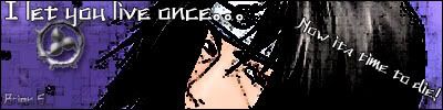 Dustin:  This thread has been moved into the Voting Stage. Keep in mind that all battles are decided by the first person to receive three(3) votes. The voting may now begin. This thread has been moved into the Voting Stage. Keep in mind that all battles are decided by the first person to receive three(3) votes. The voting may now begin.[/color]
|
|
|
|
Post by Dustin ™ on May 25, 2007 21:07:09 GMT -5
I'll take ya on. Why not. ;D
|
|
|
|
Post by Dustin ™ on May 25, 2007 22:22:13 GMT -5
|
|
Edwards
Aka: Brian Silver
Posts: 3,037
|
Post by Edwards on May 25, 2007 22:42:20 GMT -5
 I'm dead already lol I would say you win  |
|
|
|
Post by Dustin ™ on May 25, 2007 23:02:45 GMT -5
I'm dead already lol I would say you win I like yours alot actually. ;D Now to wait until this is put in the voting section... |
|
Matt
Graphics Admin  Great admin or greatest admin?
Posts: 4,891
|
Post by Matt on May 26, 2007 12:09:12 GMT -5
This thread has been moved into the Voting Stage. Keep in mind that all battles are decided by the first person to receive three(3) votes. The voting may now begin.[/color]
Brian - I like the color contrast in your signature. The stock images however, are very choppy. Try using the eraser tool to go around the edges of a stock image instead of the Magic Wand tool. The text is decent, but it's a little bit too sharp. Try setting it's anti alias to smooth or crisp. The background is fairly good, although it could be better. Maybe try using some brushes or filters to make one next time. You are getting better Dustin - The colors are very nice. The stock images are cut out well. There are some very nice effects in there as well. I would suggest lowering the opacity of the second stock image in the middle of the signature a bit more because it takes away from the rest of the image. The text is decent, although the 1px black border around it doesn't match the rest of the image very well. Might I suggestions change the text color to a darker color to match the signature better? Overall, this is a good signature for you. My vote goes to Dustin
|
|
|
|
Post by RoGeR on May 26, 2007 12:43:22 GMT -5
I will have to vote for Dustin because colors are very nice , the effect is amazing and the text is nice So nice job  |
|
~CrAzY~™
Community Admin 

The Karate Kid
What?.. Nosy Jerk..
Posts: 3,129
|
Post by ~CrAzY~™ on May 26, 2007 17:52:33 GMT -5
Brian - I'm not a big fan of how yours is so choppy. I like the positioning of the render and text, but the first thing I noticed was how choppy and pixelated the sig was, which is bad in a signature. Dustin - I like how yours seems to be smooth. I'm a Naruto fan, so I sort of don't like how that looks almost nothing like Sasuke, but that's behind the point. It could have used some sort of lighting effect to improve it. Vote: Dustin. Nice try both of you guys. |
|
Edwards
Aka: Brian Silver
Posts: 3,037
|
Post by Edwards on May 26, 2007 17:57:34 GMT -5
I win in the sense of predicting I would lose I should have smoothed out the sig after filtering it Good job Dustin |
|
|
|
Post by Dustin ™ on May 26, 2007 18:32:43 GMT -5
I win in the sense of predicting I would lose I should have smoothed out the sig after filtering it Good job Dustin Good battle Brian. ;D I seriously liked yours. I'm assuming you wanted it choppy like that. Even if not I think it gave it an interesting effect. |
|
Matt
Graphics Admin
Great admin or greatest admin?
Posts: 4,891
|
Post by Matt on May 26, 2007 18:53:07 GMT -5
Congratulations Dustin! |
|


 I'm dead already lol


