|
|
Post by integrity on May 29, 2007 20:49:33 GMT -5
Rules- Size
- Width: no greater than 400 px
- Height: no greater than 150 px
- Theme: Freestyle
- Text: Should relate to the theme you choose for your tag
- Stocks: Allowed
- Brushes: Allowed
- Animation: Not Allowed
- Due Date: Preferable in the next couple hours. If not by tomorrow.
Anyone up to it. Max people :: me + 2 = 3 extra *rules :: -must be made specifically for this battle Voting will go to 3
teg :: XD :: XD :: Carnage :: Carnage ::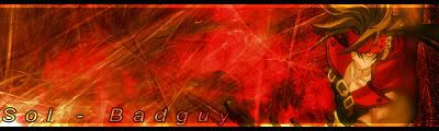 This thread has been moved into the Voting Stage. Keep in mind that all battles are decided by the first person to receive three(3) votes. The voting may now begin. This thread has been moved into the Voting Stage. Keep in mind that all battles are decided by the first person to receive three(3) votes. The voting may now begin.[/color]
|
|
Matt
Graphics Admin  Great admin or greatest admin?
Posts: 4,891
|
Post by Matt on May 29, 2007 21:22:34 GMT -5
Try to use the template next time. It can be found in the Sticky of this board.
I'll enter. Give me some time  |
|
|
|
Post by integrity on May 29, 2007 21:25:57 GMT -5
Try to use the template next time. It can be found in the Sticky of this board.
I'll enter. Give me some time I'm sorry I over looked that I'll edit it in a minute.. Okay, Lets try and make it quick though plz? |
|
Matt
Graphics Admin
Great admin or greatest admin?
Posts: 4,891
|
Post by Matt on May 29, 2007 21:28:27 GMT -5
Try to use the template next time. It can be found in the Sticky of this board.
I'll enter. Give me some time I'm sorry I over looked that I'll edit it in a minute.. Okay, Lets try and make it quick though plz? It'll be quick. Also, you're still new to the forum so it isn't a big deal. |
|
|
|
Post by integrity on May 29, 2007 21:29:44 GMT -5
It'll be quick. Also, you're still new to the forum so it isn't a big deal. okay, and i fixed it sorta anyway lol still need one more participant. |
|
Matt
Graphics Admin
Great admin or greatest admin?
Posts: 4,891
|
Post by Matt on May 29, 2007 21:40:22 GMT -5
|
|
carnageX
General Moderator 
Your Local Techy/PC Guru
SPIDERMAN!
Posts: 1,621
|
Post by carnageX on May 29, 2007 22:10:51 GMT -5
I'll enter too =P.
|
|
|
|
Post by integrity on May 29, 2007 22:31:08 GMT -5
cool. Mines done as well..  |
|
carnageX
General Moderator
Your Local Techy/PC Guru
SPIDERMAN!
Posts: 1,621
|
Post by carnageX on May 29, 2007 22:52:49 GMT -5
Working on mine as we speak =).
|
|
carnageX
General Moderator
Your Local Techy/PC Guru
SPIDERMAN!
Posts: 1,621
|
Post by carnageX on May 29, 2007 23:36:12 GMT -5
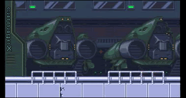
Hate to double post, but here's mine: Sol-Badguy ownzu =P. Good luck, to you guys as well ^_^. |
|
|
|
Post by integrity on May 29, 2007 23:51:16 GMT -5
Woo whooo voting |
|
Matt
Graphics Admin
Great admin or greatest admin?
Posts: 4,891
|
Post by Matt on May 30, 2007 6:12:18 GMT -5
This thread has been moved into the Voting Stage. Keep in mind that all battles are decided by the first person to receive three(3) votes. The voting may now begin.[/color]
|
|
No, it's Cymbals.
 Banned
You're not as clever as you think you are.
rofl Banned
You're not as clever as you think you are.
rofl
Posts: 2,206
|
Post by No, it's Cymbals. on May 30, 2007 9:14:57 GMT -5
Damn that was quick. I missed the whole damn thing . OK here we go Teg- Nice sig. the render blends nicely and the brushing helps bring it to gethger. Unfortunatly your sig is a little choppy. XD- Not Bad brushing is pretty well done. Try not to brush over the render to much as it is the focal point of the sig. For some strange reason your render looks to wide like it has been strecthed sideways  Carnage- Very nice sig. You love your sol- Bad guy Awsome job with the brushes. They bring your sig together and blend nicely with your render. AS for the render... It is well chosen... Blends well woth the sig. 2 points of improvement I can offer... With the text make it more to match the sig and not so bland also there is a bright red blotch in the middle. You can ake the sig look more intricate by upping the contrast and lowering the Opacity of that layer. Of the sigs It was really close. I had a hard choice between XD and Carnage but I hahve to go with Carnage. All elements of his sig just blend better than the pthers. hey integrity next time make the battle during the day when were not all sleeping |
|
~CrAzY~™
Community Admin 

The Karate Kid
What?.. Nosy Jerk..
Posts: 3,129
|
Post by ~CrAzY~™ on Jun 1, 2007 21:52:21 GMT -5
Teg - Truly terrific tag, teg. Anyways, I like the main style of this sig. There's a lot going on, but nothing too dramatic, so it feels smooth to me. I see some of the images you blended into after staring at it, which gives it a different feel to me. XD - I like the style... but you sort of dropped the ball when you stretched him like that. The flag style behind him could have also been much better. Also, the XD text is good, but the Captain America text is hard to read. Carnage - I like it, but a couple things I'm not fond of. The double horizontal border style doesn't seem to work out right. Having one or the other might have been good. Also, the fractal brushing is really obvious. You could have added a c4d or render overlay to it in some way. My Vote: Teg. |
|
Edwards
 Aka: Brian Silver
Posts: 3,037
|
Post by Edwards on Jun 1, 2007 22:11:48 GMT -5
Teg - I love all off the stuff going on and how it blends. It's smooth except for a few places here and there, which makes even more things going on in the signature. Great job XD - Stretching the render kind of misshapes the sig. Resize the render or find a different image to use. The flag seems rushed, it could have been smoother then it is. The text is hard to read, I think a drop shadow would fix that. Carnage - I like all of the colors used and how it all seems to flow towards the render. There's a lot of dead space in there, maybe try another render in there and lower the opacity. The lighting source like in most of your sigs is good My vote goes towards Teg ;D |
|
|
|
Post by crazyblue on Jun 2, 2007 12:39:44 GMT -5
Very nice battle, you all did excelent.
teg: A truely good signature, the only thing I don't like too much is that I can't see the render too well. The background is very good and the effects in it are good. I don't like the 1-color scheme though, it would be better if it was left at natural colors. I don't really like the border too much on this piece, it looks unfinished to me.
XD: This isn't your best signature and I can't say I like it too much to be honest. The render is stretched and it makes it look bad. The background is too simple for my liking, but the coloring is good. I don't like your text too much either, its not visible enough and the font isn't the best choice.
Carnage: A nice signature you have made, the only things I don't like is the 1-color scheme and the render being so off to the right. The background is different from what I've seen with brushed backgrounds but its cool. The text is a major downfall, its too large and it hides some of the background. The border is simple but the inner-border doesn't help.
My Vote: teg
Congradulations on the win, this battle has now been moved to the closed battles and locked.
|
|