|
|
Post by RoGeR on May 26, 2007 12:53:39 GMT -5
Size: Any Size Width: Any Height: Any Theme: Free Style Text: Allowed Stocks: Allowed Brushes: Allowed Animation: Not Allowed Due Date: 1 week [ Friday ] Opponents : 1 RKO:  Cymbalism:  This thread has been moved into the Voting Stage. Keep in mind that all battles are decided by the first person to receive three(3) votes. The voting may now begin. This thread has been moved into the Voting Stage. Keep in mind that all battles are decided by the first person to receive three(3) votes. The voting may now begin.[/color]
|
|
No, it's Cymbals.
 Banned
You're not as clever as you think you are.
rofl Banned
You're not as clever as you think you are.
rofl
Posts: 2,206
|
Post by No, it's Cymbals. on May 26, 2007 18:26:16 GMT -5
wat the hell count me in
|
|
|
|
Post by RoGeR on May 27, 2007 10:39:00 GMT -5
Okay  , Be sure to post your sig soon  |
|
carnageX
General Moderator 
Your Local Techy/PC Guru
SPIDERMAN!
Posts: 1,621
|
Post by carnageX on May 27, 2007 22:12:44 GMT -5
If Cymbals doesn't post one... I'l take his place =P.
|
|
No, it's Cymbals.
Banned
You're not as clever as you think you are.
rofl
Posts: 2,206
|
Post by No, it's Cymbals. on May 28, 2007 20:04:35 GMT -5
Nice try. I'll be ready by tomarrow
|
|
No, it's Cymbals.
Banned
You're not as clever as you think you are.
rofl
Posts: 2,206
|
Post by No, it's Cymbals. on May 28, 2007 20:26:48 GMT -5
nvrmnd. Lets go  A special thanx to Carnage for showing me how to brush |
|
carnageX
General Moderator
Your Local Techy/PC Guru
SPIDERMAN!
Posts: 1,621
|
Post by carnageX on May 28, 2007 20:42:46 GMT -5
You're welcome  . |
|
Matt
Graphics Admin  Great admin or greatest admin?
Posts: 4,891
|
Post by Matt on May 28, 2007 21:02:55 GMT -5
This thread has been moved into the Voting Stage. Keep in mind that all battles are decided by the first person to receive three(3) votes. The voting may now begin.[/color]
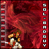
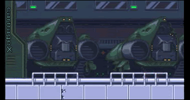
RKO - I really like yours. Everything blends well, the stock image fits in nicely. The only problem I have with it is the text. I think that it would look a bit better if you made the R a bit smaller and made it stand out more then the K and O. Overall, nicely done. Best image I've seen from you  Cymbalism - Huge improvement. Huge. I love the abstractness of your signature and the colors. Like RKO's, the only thing wrong with it is the text. You used a pixel font, which I would recommend you keep to size 8. Otherwise it looks strangely enlarged. You also might want to add a border your signature. You can do this by hitting Control + A on your keyboard to select the whole image and by going to Edit>Stroke> 1px inside. I usually use black(000000). Huge improvement though RKO gets my vote. It was close though
|
|
No, it's Cymbals.
Banned
You're not as clever as you think you are.
rofl
Posts: 2,206
|
Post by No, it's Cymbals. on May 28, 2007 22:33:35 GMT -5
thanx. thot i added a border
|
|
|
|
Post by integrity on May 29, 2007 20:50:42 GMT -5
I can't see !.~ (CYMBALS)(:~.!'s image it says [image] |
|
Matt
Graphics Admin
Great admin or greatest admin?
Posts: 4,891
|
Post by Matt on May 29, 2007 21:43:38 GMT -5
|
|
carnageX
General Moderator
Your Local Techy/PC Guru
SPIDERMAN!
Posts: 1,621
|
Post by carnageX on May 30, 2007 0:21:54 GMT -5
I'll vote for Cymbal's =). He's shown quite a bit of improvement over his last sigs, so I'll give him kudos for that ^_^.
|
|
No, it's Cymbals.
Banned
You're not as clever as you think you are.
rofl
Posts: 2,206
|
Post by No, it's Cymbals. on May 30, 2007 9:22:56 GMT -5
damnit y does that keep happening
|
|
|
|
Post by RoGeR on Jun 5, 2007 12:10:48 GMT -5
So votes are tied ;D
|
|
No, it's Cymbals.
Banned
You're not as clever as you think you are.
rofl
Posts: 2,206
|
Post by No, it's Cymbals. on Jun 8, 2007 16:50:50 GMT -5
sorry I just realized that nobody can vote cuz me image is down. hey RKO will you edit thy first post |
|
Edwards
 Aka: Brian Silver
Posts: 3,037
|
Post by Edwards on Jun 8, 2007 17:03:50 GMT -5
RKO - The blending is very well done, and I love the wave/ripple effect ;D I can see a lighting source, but there isn't any shading/lighting done to the render for what I see  I like the text, try doing a mirror effect with it. Cymbals - All of the colors doesn't really make it look all great. The lighting in the middle is really good, that's probably the best part of the sig. There's also a nice sense of depth with the "vortex" the lighting makes. The text needs to be smaller and maybe lower the opacity. Also add some form of a border My vote goes to Cymbals, Good job |
|
|
|
Post by PђΘeйiX on Jun 8, 2007 20:43:33 GMT -5
Cymbals GMV. Reason? Well RKO has used that sig FAR too much in battles and it needs a hell of a lot more work. Cymbals' one actually looked decent compared to RKO's and was more attractive. Good job |
|
Matt
Graphics Admin
Great admin or greatest admin?
Posts: 4,891
|
Post by Matt on Jun 8, 2007 21:44:15 GMT -5
Congratulations Cymbals! |
|