|
|
Post by Dustin ™ on Jun 17, 2007 14:19:14 GMT -5
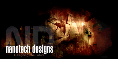
Ok it's a match between me and Brian. Already decided through IM. Sig match. No specific size limit. No animations. Basically only thing required is to use this render: planetrenders.net/renders/displayimage.php?pos=-628Dustin's :  Brian's : 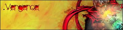 Voting to 3 obviously. This thread has been moved into the Voting Stage. Keep in mind that all battles are decided by the first person to receive three(3) votes. The voting may now begin.[/color]
|
|
Edwards
 Aka: Brian Silver
Posts: 3,037
|
Post by Edwards on Jun 17, 2007 15:00:02 GMT -5
Oh I love those effects, but no light source D: |
|
No, it's Cymbals.
 Banned
You're not as clever as you think you are.
rofl Banned
You're not as clever as you think you are.
rofl
Posts: 2,206
|
Post by No, it's Cymbals. on Jun 17, 2007 16:20:01 GMT -5
Wow this is hard to decide... They're both really good...  Brian- Sweet sig. You are definatly getting better. I like the glow effect but its too bright. Lower the brightness/Opacity a little bit. As for the brushed Backround, Brush it a little bit more with a slightly darker color to give it more depth. I like the font you used as well as the phrase. Nice job Dustin- Awsome sig. However It's definatly not ur best. I do like it alot tho. Theres nothing I can really suggest. I would normally suggest a light source but for the style of the sig you proably don't need one. I like the blending of the effects and colors. The whole sig blends really well.  It was, Like I said, a very hard choice between two great sigs however in the end I have to vote for Dustin. Great Job Guys!!! |
|
Matt
Graphics Admin  Great admin or greatest admin?
Posts: 4,891
|
Post by Matt on Jun 26, 2007 1:32:59 GMT -5
Dustin - The colors are a little dull for my liking but they blend in nicely. I'm not sure what it is about the text but it's unappealing to me. Try setting it's blending option to overlay or lowering its opacity. I'm also not a fan of the inner glow on the image. I'd recommend you take that off. Nice job.
Brian - The blending on parts of your image is the best I have seen from you. You've gotten a lot better while I was away. The Lighting effect isn't very good looking on this image so you might want to take that off. I'm also not a fan of the "Vengence" text. Doesn't seem to fit in very well with the rest of the image. The Brian S text is placed well. Good job
Dustin gets my vote.
|
|
|
|
Post by aoeclald on Jun 26, 2007 2:36:08 GMT -5
Well, guess it's up to me to end this battle, hmm? I've put off my vote for too long and now that I know both of you are quite capable of doing much better, no hard feelings, right? Lol. Dustin gets my vote for this one. I was debating between you and Brian, but I think you (incorrectly, although you did) remove a lot of negative space rather than leaving a lot of it open and plain like in Brian's. Next time, I wouldn't keep a render so large and focus more on the effects. You also had a much better blending attempt and the colored pencil effect looks pretty nice on this. It's missing most of the basic stuff though except blending, such as lighting, depth, etc. Brian - I think if you put some more effects and a better lighting source... as well as centering your render (which you never do >_>) it would have looked a lot better. And yes, the Vengence (VengeAnce) text is quite a bit large. Try to stick to simple and small, not large and in your face  Good job both of you and congratulations Dustin. |
|
Matt
Graphics Admin
Great admin or greatest admin?
Posts: 4,891
|
Post by Matt on Jun 26, 2007 11:34:41 GMT -5
Congratulations Dustin!
|
|