|
|
Post by integrity on Jun 1, 2007 20:30:44 GMT -5
Rules- Size
- Width: no greater than 500px
- Height: no greater than 200
- Theme: you favorite music artist
- Text: must match your theme
- Stocks: allowed
- Brushes: allowed
- Animation: no
- Due Date: asap
Other Information: 1 VS 1 first come first server. Voting will be to 3. Oh and good luck too 
Teg ] Brian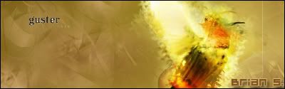 ] This thread has been moved into the Voting Stage. Keep in mind that all battles are decided by the first person to receive three(3) votes. The voting may now begin.[/color]
|
|
Edwards
 Aka: Brian Silver
Posts: 3,037
|
Post by Edwards on Jun 1, 2007 20:33:02 GMT -5
Me, I need to get my ass kicked a few more times lol
|
|
|
|
Post by integrity on Jun 1, 2007 20:42:22 GMT -5
your on i'm starting now... good luck |
|
Edwards
Aka: Brian Silver
Posts: 3,037
|
Post by Edwards on Jun 1, 2007 21:20:55 GMT -5
I'm done, I feel like I'm actually starting to get CS2 in a new way. So many doors unlocked. Anyway here's mine: I learned how to use the smudge tool  |
|
|
|
Post by integrity on Jun 1, 2007 22:26:14 GMT -5
I'm done too, good luck |
|
Matt
Graphics Admin  Great admin or greatest admin?
Posts: 4,891
|
Post by Matt on Jun 1, 2007 22:36:10 GMT -5
This thread has been moved into the Voting Stage. Keep in mind that all battles are decided by the first person to receive three(3) votes. The voting may now begin.[/color]
Integrity - I really like the color combination and the background of this image. The text also fits it very well. You might want to lower the opacity of the text a tad. The stock image is blended in well, but has some sharp corners around the person's head. It is also lacking a border. Great job though Brian - There really isn't much going on in your sig. The colors are kind of bland and the stock image isn't very large. I'd suggest making the sig smaller to match the size of the stock. The guster text looks like you cut it out from somewhere, but not very well. There are some white areas around the text and they are very distracting. The Brian S. text should be smaller since you're using a pixel font. I try to keep mine at size 8 font. Integrity gets my vote.
|
|
|
|
Post by integrity on Jun 1, 2007 22:44:00 GMT -5
Crap i knew i forgot something... I'm not thinking tonight.. Sorry.. Thanks for the vote and suggestions 1:0 |
|
No, it's Cymbals.
 Banned
You're not as clever as you think you are.
rofl Banned
You're not as clever as you think you are.
rofl
Posts: 2,206
|
Post by No, it's Cymbals. on Jun 2, 2007 15:31:18 GMT -5
Teg gets my vote. Well blended sig however careful with ur rendering because It looks like daughtry has hair =P
Brian you are def getting better but I liked your jack sparrow sig it was much better. This sig has a blurry render... too blurry ewhat exactly is that
EDIT: stop makin ur posts so late at night
|
|
|
|
Post by integrity on Jun 2, 2007 15:37:06 GMT -5
EDIT: stop makin ur posts so late at night I'm sorry... i work lol |
|
No, it's Cymbals.
Banned
You're not as clever as you think you are.
rofl
Posts: 2,206
|
Post by No, it's Cymbals. on Jun 3, 2007 12:52:48 GMT -5
lol how old are you
|
|
Matt
Graphics Admin
Great admin or greatest admin?
Posts: 4,891
|
Post by Matt on Jun 3, 2007 12:55:14 GMT -5
Please try to stay on topic. |
|
No, it's Cymbals.
Banned
You're not as clever as you think you are.
rofl
Posts: 2,206
|
Post by No, it's Cymbals. on Jun 3, 2007 13:55:58 GMT -5
oops sorry
|
|
|
|
Post by integrity on Jun 3, 2007 15:53:20 GMT -5
I am 20 almost 21 lol 2-0 keep them coming people |
|
|
|
Post by Smangii on Jun 28, 2007 20:53:43 GMT -5
Vote: IntegrityCould see the image more clearer than Brians, and I like the colors and effects more. Seemed a bit more effort-full  nicely done! Congratulations, you WIN! =] *moved* |
|