|
|
Best
Aug 28, 2007 8:31:09 GMT -5
Post by RoGeR on Aug 28, 2007 8:31:09 GMT -5
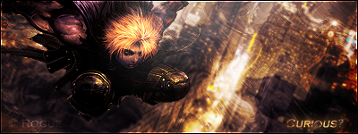
 Well, I think it's my best ;D Rates please  |
|
|
|
Best
Aug 28, 2007 17:27:06 GMT -5
Post by De$ertW0lfo1 on Aug 28, 2007 17:27:06 GMT -5
love the abstract look, but text dosnt realy fit.  |
|
|
|
Best
Aug 28, 2007 18:07:14 GMT -5
Post by aoeclald on Aug 28, 2007 18:07:14 GMT -5
Text doesn't fit, as Desertwolf said. Also, I would add some orbs coming in from the front and going into the little vortexy-thing for lighting and a more... cool look. But yes, very nice  |
|
Edwards
 Aka: Brian Silver
Posts: 3,037
|
Best
Aug 28, 2007 18:22:25 GMT -5
Post by Edwards on Aug 28, 2007 18:22:25 GMT -5
Where's the render?   |
|
|
|
Best
Aug 28, 2007 22:21:31 GMT -5
Post by R Ø G U € » on Aug 28, 2007 22:21:31 GMT -5
1. Find a better font. 2. use some effects on it and blend it. 3. make the text 3D with lighting (May'be "outer glow"?) 4. (optional) get a render in there. 4.5/5 Good job! |
|