|
|
|
|
Post by Toothpick on Sept 15, 2007 12:32:02 GMT -5
Cant tell what anything is..
and the text is unreadable.
|
|
No, it's Cymbals.
 Banned
You're not as clever as you think you are.
rofl Banned
You're not as clever as you think you are.
rofl
Posts: 2,206
|
Post by No, it's Cymbals. on Sept 15, 2007 12:35:01 GMT -5
tis your best yet but it needs lots of work
|
|
Gamoc
 Smiley Abuser
  & Big Word Abuser..
Defying Gravity! & Big Word Abuser..
Defying Gravity!
Posts: 3,935
|
Post by Gamoc on Sept 15, 2007 14:00:57 GMT -5
Okay, how is this for text.  |
|
|
|
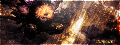
Post by R Ø G U € » on Sept 15, 2007 15:44:03 GMT -5
 Rates please.  This one looks really flat. There's no depth to it at all.  (light-sources and shadows my friend, those are what help give sigs depth.) It looks like you used the same color(s) as the render for the BG, that "blends" the render too much and makes it lost/flat IMO. Try using a different color. Like, maybe a darker shade of purple, with some black too. The text is VERY hard to read. Stop trying to "hide" your text ALL the time. It's okay to make it stand out sometimes.  This one needs a lot of work. 5.5/10 Keep reading those tuts, and practicing. |
|
Gamoc
Smiley Abuser & Big Word Abuser..
Defying Gravity!
Posts: 3,935
|
Post by Gamoc on Sept 15, 2007 17:04:56 GMT -5
Well, how does this look for a better siggy.  |
|
|
|
Post by R Ø G U € » on Sept 15, 2007 18:08:26 GMT -5
Well, how does this look for a better siggy. Try using a differn't color for the BG brushing. (Or are those C4Ds?) You don't necessarily need to redo the BG. Just put Gradient Map over it. ( Gradient Map Tut) Why is your text ALWAYS pixelated? lol Try setting the anti-alias mode to "smooth".That should help you. lol |
|
Gamoc
Smiley Abuser & Big Word Abuser..
Defying Gravity!
Posts: 3,935
|
Post by Gamoc on Sept 15, 2007 19:52:00 GMT -5
I know gradient maps. I use those a lot. They are C4DS Well, I added some color, and I did the whole smooth thing, but it didn't look like it did anything, here you go though.  |
|
|
|
Post by R Ø G U € » on Sept 15, 2007 20:06:15 GMT -5
I know gradient maps. I use those a lot. They are C4DS Well, I added some color, and I did the whole smooth thing, but it didn't look like it did anything, here you go though. Better. Now that your using a differn't color its easier to distinguish the render, and you've got a bit of a flow going aswell. The text looks better now that its not pixelated, but now it's color doesn't quite seem to fit there, and I feel like you should do something more to it... I can't think of anything at the moment. Try sprucing up that top left corner a little bit more. Work on the text, the slightly empty space behind it, and the light/shadows just a little bit more. Overall: 6.9/10 It's coming together, keep practicing. |
|
Gamoc
Smiley Abuser & Big Word Abuser..
Defying Gravity!
Posts: 3,935
|
Post by Gamoc on Sept 15, 2007 20:50:29 GMT -5
 Okay, thanx. How is this one. |
|
|
|
Post by R Ø G U € » on Sept 15, 2007 21:05:04 GMT -5
Okay, thanx. How is this one. Is that another c4d? Whatever it is, make it more visible.  Make the text more visible by changing its color, and may'be change the font to soemthing a little more spiffy. (I recommend riVen) Try that and lets see how it looks ;D EDIT: i just noticed something. Did you misspell your name on the sig? lol Your name is " pikablu" right? On your sig it says, " pikiablu" . |
|
Gamoc
Smiley Abuser & Big Word Abuser..
Defying Gravity!
Posts: 3,935
|
Post by Gamoc on Sept 15, 2007 21:13:16 GMT -5
Ooh, that text looks nice. Here is the new result.  BTW: Thanx for pointing that out. |
|
|
|
Post by R Ø G U € » on Sept 15, 2007 21:17:08 GMT -5
Ooh, that text looks nice. Here is the new result. BTW: Thanx for pointing that out. Looks good. Just make the C4D lookin' thing behind the text more visible, and lower the opacity of the white smudge looking layer, if you can. |
|
Gamoc
Smiley Abuser & Big Word Abuser..
Defying Gravity!
Posts: 3,935
|
Post by Gamoc on Sept 15, 2007 21:50:17 GMT -5
Hmm...Took me a sec to figure out what you were talking about, but how is this.  |
|
|
|
Post by R Ø G U € » on Sept 15, 2007 21:57:59 GMT -5
Hmm...Took me a sec to figure out what you were talking about, but how is this. (LOL I'm so hard to please. JK) There you go! Do that a little bit more, and that should make it perfect. The last thing I can suggest is maybe give your text a mauve outerglow to make it spiffy. Overall: 8/10 |
|
Gamoc
Smiley Abuser & Big Word Abuser..
Defying Gravity!
Posts: 3,935
|
Post by Gamoc on Sept 15, 2007 22:00:51 GMT -5
an 8/10 awesome.  How do I do a mauve outerglow, exactly. |
|
|
|
Post by R Ø G U € » on Sept 15, 2007 22:08:06 GMT -5
an 8/10 awesome. How do I do a mauve outerglow, exactly. Just pick a mauve-ish color. Copy the hex number. Then paste it into your outerglow color picker. Be sure to make the C4D a little more visible too. Like before, but not quite as much. |
|
Gamoc
Smiley Abuser & Big Word Abuser..
Defying Gravity!
Posts: 3,935
|
Post by Gamoc on Sept 15, 2007 22:13:08 GMT -5
Dang, that's what I did in the first place, it was the mauve thing that threw me off. It doesn't seem like it made a big difference, but here it is.  |
|
|
|
Post by R Ø G U € » on Sept 15, 2007 22:15:20 GMT -5
Dang, that's what I did in the first place, it was the mauve thing that threw me off. It doesn't seem like it made a big difference, but here it is. You can try a dark purple color, or adjust the settings. See if that does it. Here you go. try this:  Thats just an example. It should be subtle. I beleive you can tone it down by adjusting the opacity and the range. |
|
Gamoc
Smiley Abuser & Big Word Abuser..
Defying Gravity!
Posts: 3,935
|
Post by Gamoc on Sept 15, 2007 22:26:51 GMT -5
Hmm...  How is this? BTW: I exalted you |
|
|
|
Post by R Ø G U € » on Sept 15, 2007 22:28:35 GMT -5
Hmm... How is this? BTW: I exalted you Thanks lol Tone down the purple (Gradient Map?) just a bit and you'll be golden. |
|
Gamoc
Smiley Abuser & Big Word Abuser..
Defying Gravity!
Posts: 3,935
|
Post by Gamoc on Sept 15, 2007 22:29:39 GMT -5
Okay, here it is.  |
|
|
|
Post by R Ø G U € » on Sept 16, 2007 17:19:31 GMT -5
Okay, here it is. Not quite like that. You don't want the render to be the exact same color as the BG. Thats what I was trying to say before, I just worded it in a retarded way. lol What you want is "contrasting" colors to help give depth. For example: If you use white text on a sig, you'd naturally use a 1px black stroke to help it stand out a little more. You wouldn't use a white 1px stroke on white text because it wouldn't make it stand out. And the same is true for renders and backgrounds. In other words, you want a small variety of colors to help give depth, and help give a flow. you can use the bright purples for lighting, and the darker purples for shadows. When I look at your render, I invision the lighting coming from below, where "lugia" is looking. (And I don't know if you some my edited post on the previous page, but I gave you a tip on outerglows.) |
|
Gamoc
Smiley Abuser & Big Word Abuser..
Defying Gravity!
Posts: 3,935
|
Post by Gamoc on Sept 16, 2007 18:28:03 GMT -5
 Hmm...well, how is this. Is it any better. |
|
|
|
Post by R Ø G U € » on Sept 16, 2007 18:43:00 GMT -5
Hmm...well, how is this. Is it any better. Just throw a gradient map on everything but the render and text. ( That is, if thats what you did before...) |
|
Gamoc
Smiley Abuser & Big Word Abuser..
Defying Gravity!
Posts: 3,935
|
Post by Gamoc on Sept 16, 2007 19:21:01 GMT -5
Well, considering that my text and my render are on different parts of the layer graph, so it would be really hard to work that. Thanx for you help, though. You were a huge help. |
|
|
|
Post by R Ø G U € » on Sept 16, 2007 19:26:16 GMT -5
No problem |
|