Gamoc
 Smiley Abuser
  & Big Word Abuser..
Defying Gravity! & Big Word Abuser..
Defying Gravity!
Posts: 3,935
|
Post by Gamoc on Oct 5, 2007 17:02:22 GMT -5
 How did I do on this one? |
|
|
|
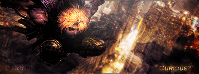
Post by CrazieGrafix on Oct 5, 2007 17:56:11 GMT -5
i like it the background effects are nice and doesn't take away from the main image.
|
|
Gamoc
Smiley Abuser & Big Word Abuser..
Defying Gravity!
Posts: 3,935
|
Post by Gamoc on Oct 5, 2007 20:24:22 GMT -5
Thanks, I'm glad you like it.  |
|
|
|
Post by R Ø G U € » on Oct 6, 2007 16:12:32 GMT -5
( Sorry if my rate ends up low, I'm not using my usual HD monitor. ) The render is a kinda large considering the canvas size, but I like how it looks like a close-up . ...But on the other hand, the render isn't blended... Try and blend it in a little.  The BG looks like it has something interesting going on, but it's hard to tell... (Render size, opacity/color choice, etc?) By looking at the cat I can tell the light should be coming from the left. Play around with the lightsource, and add some shadows. Overall:5/10 I like where you were going with this. Lets see a V.2. |
|
Gamoc
Smiley Abuser & Big Word Abuser..
Defying Gravity!
Posts: 3,935
|
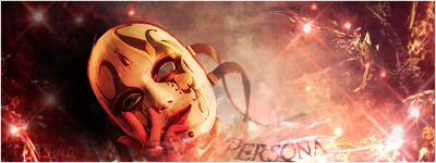
Post by Gamoc on Oct 6, 2007 19:52:07 GMT -5
Oh, that sounds good, I did it and it added a very nice touch to the siggy.  |
|
|
|
Post by R Ø G U € » on Oct 6, 2007 22:55:47 GMT -5
Oh, that sounds good, I did it and it added a very nice touch to the siggy. Looks good , but now you should add some C4Ds in areas and get some color varience. The C4Ds will add some flow too. The text is bit on the bold side. I would turn it down a smidge. Some clipping masks, pentooling, and C4Ds (if used sparingly) could add some really nice effects to the sig. I'm not a huge fan of the gold colors, but it seems to work. I would keep using them unless you find something better. |
|
No, it's Cymbals.
 Banned
You're not as clever as you think you are.
rofl Banned
You're not as clever as you think you are.
rofl
Posts: 2,206
|
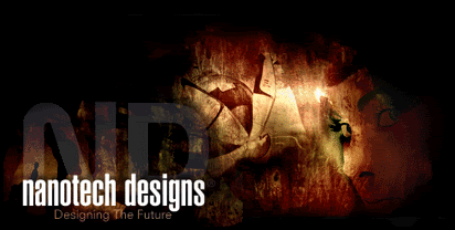
Post by No, it's Cymbals. on Oct 7, 2007 9:40:06 GMT -5
Blend the render.
Smaller render or bigger sig.
More effects.
More colors.
|
|