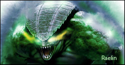
Raelin
 Van Buren+Sax=Vanbursaxy
Posts: 38
|
Post by Raelin on Oct 27, 2007 22:23:23 GMT -5
|
|
|
|
Post by R Ø G U € » on Oct 29, 2007 21:13:53 GMT -5
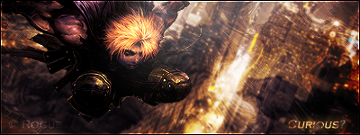
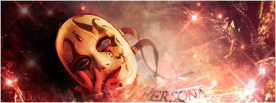
Since you have three versions I'll keep it short and simple.  Version 1 Version 1: The "beam" going across the chick's head is distracting, maybe you could lower the opacity or move it behind her head? She's not blended in "great"... Grab your smudge brush, duplicate the chick 2-3 times, and smudge around her a little. The black text kinda sticks out, try an outer/inner glow on it. The BG effects are a little over whored, you could easily erase some of it to open it up so it doesn't look like a solid wall. Finally, it needs a border. Version 2: I like how the "beam" is behind her head in this one, but my opinion on the text still stands. I don't like how she looks like a copy&paste with no blending. Smudge! xD I don't like how the bottom is "faded" looking, a little goes a long way. I still think you should add a border... Version 3: This one is definitely better than the others, mostly because it's the most "balanced" with the effects used. Move the beam behind her head and substitute it with some other kind of foreground effect. Add the inner/outer glow to the text, add a border. You need some depth in your Sig's, right now they look like flat solid walls of effects. Overall: 5.5/10, 3/10, 6.5/10. Hope that helped.  |
|