Raelin
 Van Buren+Sax=Vanbursaxy
Posts: 38
|
Post by Raelin on Oct 30, 2007 17:50:35 GMT -5
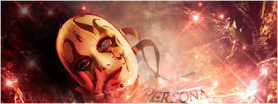
 Unusual style, but it seems to work cohesively... |
|
|
|
Post by R Ø G U € » on Oct 31, 2007 20:23:21 GMT -5
Nice.  I like how you made the text look like brushed aluminum. On top of that, you also have decent lighting. (High-fives) The only thing that I see you could improve on is: The lighting and blending on the render. You can use the burn tool to get the render's lighting to match. As for blending, it looks fine the way it is now, but I think you could do something to make it match the metal BG more. Overall: 7.7/10(Oh, and Pikablu, if your reading this, this is a good example of a clipping mask.  ) ) |
|