|
|
Post by aoeclald on Dec 1, 2007 22:35:37 GMT -5
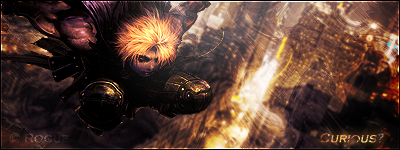
Comments and critique accepted. (critique wanted  !) |
|
Edwards
 Aka: Brian Silver
Posts: 3,037
|
Post by Edwards on Dec 1, 2007 22:44:22 GMT -5
You might want to put the original Anyway, I can see you've done a lot of work. There's a nice sense of depth, things getting sharper the closer they are. A lot of smudging I can see, and it does add to it. The only thing I could say is the background is kind of plain, so maybe you could add something back there? |
|
|
|
Post by R Ø G U € » on Dec 3, 2007 0:48:05 GMT -5
I like the colorscheme, and I like how it's minimalistic, but the BG/FG seems a little too plain. IMO, there's not much flow because it's on the simpler side. Lighting looks decent, but could be better. (Don't I know it. ) Try giving him a shadow.  I think the BG could use some contrast as well. I think you should add some small effects behind those lines on low opacity, and add some subtle foreground effects. Overall: 6.5/10 Hope that helped. |
|