|
|
Post by aoeclald on Dec 3, 2007 21:36:42 GMT -5
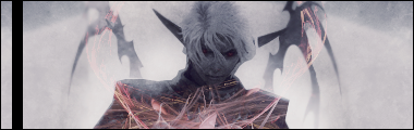
C&C? I had a trouble blending in my fractals and C4D... any ideas? Or are these ok? |
|
|
|
Post by R Ø G U € » on Dec 3, 2007 23:00:42 GMT -5
Is this a manipulation or a render? You should try and brighten up his eyes so he looks more menacing. ;D Anyways, get rid of that black border on the left; It's murdering your tag. xD Replace it with a real border AROUND the sig. (Every peice of art deserves a frame.  lol) The brushing/C4Ds looks... For lack of less harsh word: terrible. It's a bad idea to put stuff over your render, unless it really flows with the tag. Brush behind him and blend it in. The BG seems a little too uniform and doesn't have much contrast. Try soft-brushing in some black and smudge it. I like the depth on this on alot, but you need to blend in your guy better. It looks foggy/misty, try and capitalize on that. (Smudge! lol) There's no flow in this tag... Try and a little.  Lighting is way off. Lighting should be coming from behind/ top left of him. Overall: 3/10. This tag needs a lot of work, but with some expieriments/ tuts you should be able to fix it.  Hope that helped. |
|
|
|
Post by aoeclald on Dec 4, 2007 18:17:29 GMT -5
There is a border around it, plus the black bar And not every piece deserves a frame... some sigs are better off without borders Thanks for the comments, I'm sure to take it all into account EDIT: Well, considering that I applied image with the fractal about 4 times in my signature, ti will be very difficult to do changes to it, so I'm just going to leave it as is and work on a different sig, THOUGH, I will take your suggestion and try out that black smudging just so I cna get some practice and see how it looks |
|
|
|
Post by bfg15000 on Dec 7, 2007 10:02:31 GMT -5
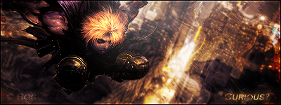
Cool looking, but kind of edgy. In other words, it's looks like a cutout with a background.  |
|