|
|
Post by Kronus on Dec 28, 2007 2:08:27 GMT -5
 C/C? |
|
Edwards
 Aka: Brian Silver
Posts: 3,037
|
Post by Edwards on Dec 30, 2007 12:18:11 GMT -5
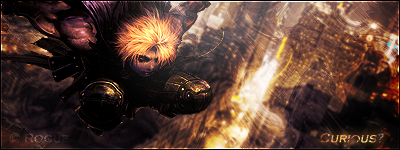
Smudging ftw? Its actually pretty good. I'm sure you could build off of it though. The text flows really well, just a bit too close to the light though (I can barely read the first few letters in "breaking"). Nice job  |
|
No, it's Cymbals.
 Banned
You're not as clever as you think you are.
rofl Banned
You're not as clever as you think you are.
rofl
Posts: 2,206
|
Post by No, it's Cymbals. on Jan 7, 2008 0:26:29 GMT -5
add a c4d in there and it could be a winner  looking good |
|
~CrAzY~™
Community Admin 

The Karate Kid
What?.. Nosy Jerk..
Posts: 3,129
|
Post by ~CrAzY~™ on Jan 9, 2008 20:02:10 GMT -5
It's a very simple sig, but it has a pretty big kick to it. I like the overall, but it just doesn't seem finished... I think using it as a bg would be the makings of a very good signature. It flows very well and I like the lighting. The text being "Breaking Point" doesn't seem to make a whole lot of sense though...
|
|
|
|
Post by R Ø G U € » on Jan 12, 2008 20:39:30 GMT -5
C/C? First off, WOW.Your very skilled at smudging, and your color choice is perfect. I don't think you should add any C4Ds to it. With something this good, you should be able to say you made everything. Instead, you should refine it more. Here are some suggestions: -DEPTH: Your tag looks really flat right now, and would look even better with some depth. Try using the blur/sharpen tools to add some depth little-by-little untill you have it where you like it. I reccomend blurring outwards from the focal, the light, or vice-versa, -LIGHTING: The lighting is good. It's coming from off-screen like it should be.. But it seems a little too strong. -TEXT: As menoned above, it's hard to read, I would edit that a bit... Either make it a little bit bigger, or re-place it. -Flow: The flow is great. It's spraying outwards, but ripples on it's way out like smoke. Overall: 8.5/10 VERY GOOD. Just a few minor tweaks. |
|