|
|
Post by R Ø G U € » on Mar 13, 2008 23:42:25 GMT -5
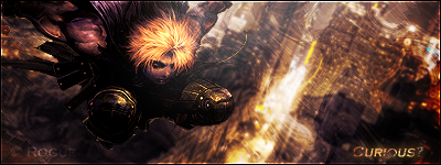
I've been trying hard to improve... I looked at some tuts and observed some tags on a few sites. This is what I came up with: 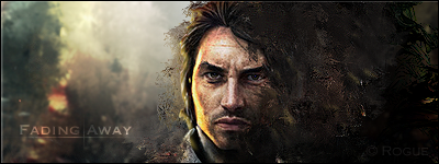 What do you think? I saved the .psd so I can modify it a little. C&C? |
|
|
|
Post by aoeclald on Apr 16, 2008 21:13:42 GMT -5
Rogue, replace the image in your signature that says "Favorite-ness" with this one because this one is awesome! I really enjoyed this. Work on text... the placement is off and I think the text could have been "upped" for the quality of this great signature. Get a lighting source on the left side that is yellow/goldish to match his face. Right side is the best. Looks like I have some learning frm you to do  Great job. Keep up the good work. I'm glad I am back! |
|