Edwards
 Aka: Brian Silver
Posts: 3,037
|
Post by Edwards on Jun 27, 2007 19:08:48 GMT -5
Rules - Size
- Width: 100-500
- Height: 100-200
- Theme: Freestyle
- Text: Atleast your name.
- Stocks: Yesh
- Brushes: Yesh
- Animation: Nu
- Due Date: June 29 (Friday)
Who wants to take meh on? Brian:  Cymbals: 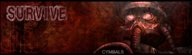 Smangii:  This thread has been moved into the Voting Stage. Keep in mind that all battles are decided by the first person to receive three(3) votes. The voting may now begin. This thread has been moved into the Voting Stage. Keep in mind that all battles are decided by the first person to receive three(3) votes. The voting may now begin.[/color]
|
|
|
|
Post by Smangii on Jun 28, 2007 20:36:07 GMT -5
ME!
cuz me needs praktiss =[
|
|
No, it's Cymbals.
 Banned
You're not as clever as you think you are.
rofl Banned
You're not as clever as you think you are.
rofl
Posts: 2,206
|
Post by No, it's Cymbals. on Jul 1, 2007 10:09:24 GMT -5
MAy I also enter. I made a new siggy and I was gonna start my own battle. But I wanna take on the Smanger and you at the same time Quake in fear of my bestest siggy eva |
|
Edwards
Aka: Brian Silver
Posts: 3,037
|
Post by Edwards on Jul 1, 2007 12:14:42 GMT -5
Wewt we might have a chance, since Smangii hasn't made signatures in awhile. I at least to my knowledge o: Somewhat of a negative space sig. |
|
|
|
Post by Smangii on Jul 1, 2007 14:14:24 GMT -5
Yeah =[ Sadly, I don't do sigs anymore but nothing hurts to try XD Wewt? |
|
Edwards
Aka: Brian Silver
Posts: 3,037
|
Post by Edwards on Jul 1, 2007 15:35:39 GMT -5
This thread has been moved into the Voting Stage. Keep in mind that all battles are decided by the first person to receive three(3) votes. The voting may now begin.[/color]
Use this next time smamgii 
|
|
Matt
Graphics Admin  Great admin or greatest admin?
Posts: 4,891
|
Post by Matt on Jul 1, 2007 17:03:18 GMT -5
Brian - Wow. By far the best I have ever seen from you. This image truly made me question my decision. Very nice, I really have no suggestions. Cymbals - I'm not a huge fan of the Survive text, it could fit in a lot better. Everything is blended in nicely. Great work.  Smangii - I'm not a fan of the black area on the left. Seems like an error that you didn't see, even though I doubt it was. I'm also not a fan of the DA text. Everything is blended amazingly. Great job. Smangii gets my vote, but Brian's was close. |
|
~CrAzY~™
Community Admin 

The Karate Kid
What?.. Nosy Jerk..
Posts: 3,129
|
Post by ~CrAzY~™ on Jul 2, 2007 2:29:26 GMT -5
Hmm...
Brian: Seems to be your best yet.. The text didn't work to much for me though. Also it was very bright, but that's not too much of a bad thing.
Cymbals: I really liked the colorization of this sig. There's a little too much negative space though. Also, lower the cymbals text opacity more next time.
Smangii: Nicely blended sig. The CA text was.. decent. The border threw it off a little for me, but the lighting effects and focal point brought it back.
My vote.... Smangii.
|
|
|
|
Post by Smangii on Jul 2, 2007 18:37:20 GMT -5
=o thanks for the votes
|
|
|
|
Post by De$ertW0lfo1 on Jul 4, 2007 9:14:13 GMT -5
My vote goes to "Brian" ....
I love that abstract look of it...
;D ;D
|
|
|
|
Post by aoeclald on Jul 5, 2007 10:02:22 GMT -5
My vote goes to BrianRemove the text and just give it that abstract look. The effects you used are amazing. Maybe remove some width from both sides, but other than that, I was... shocked. Smangii was close behind for 2nd place. I think it was just that his was 3rd. The effects used here were nice as well, I just saw Brian's first  I am not too keen on the text and I think there could have been some more effects, especially with lighting, used here. Great job, nonetheless. Cymbals - You did a really great job. You're blending has improved quite a bit. The "Cymbals" text is the best. The "SURVIVE" text is too large and doesn't seem to fit anyway. Just remove it, or at least make it smaller. Now just work on the other aspects of a signature such as Lighting, Depth, etc. And make it less monotone. Add some more bright/dark reds, etc. |
|
|
|
Post by madmanjimmy on Jul 6, 2007 19:07:45 GMT -5
There all awsome guys...
But I have to go with Cymbals =]
I love the colours and the text goes so well with it.
The others jsut seemed a little plain.
Nice job Cymbals. (y)
|
|
No, it's Cymbals.
Banned
You're not as clever as you think you are.
rofl
Posts: 2,206
|
Post by No, it's Cymbals. on Jul 7, 2007 17:19:19 GMT -5
wow I actually got a vote *Faints*
Smang - 2
Edwards - 2
Cymbals - 1
This is gonna be close O.o
|
|
|
|
Post by /~/VARNADIZZLE\~\ on Jul 12, 2007 20:20:18 GMT -5
My vote goes to cymbals great gfx
|
|
|
|
Post by /~/VARNADIZZLE\~\ on Jul 12, 2007 20:21:53 GMT -5
now it is
2
2
2
|
|
No, it's Cymbals.
Banned
You're not as clever as you think you are.
rofl
Posts: 2,206
|
Post by No, it's Cymbals. on Jul 13, 2007 11:07:32 GMT -5
Dude you can't Just vote for me cuz ur my friend. I wanna win fairly or not at all. If you voted for me cuz you think that mine has better graphical elements then theirs then post the reasons you think my siggy is better then theirs Ok? Also dont double post or XD will rape you O.o  |
|
Edwards
Aka: Brian Silver
Posts: 3,037
|
Post by Edwards on Jul 13, 2007 12:13:10 GMT -5
Please do not double post. Also, please give a reason to why you voted for Cymbals, just voting for him because he's your friend is biased.
|
|
No, it's Cymbals.
Banned
You're not as clever as you think you are.
rofl
Posts: 2,206
|
Post by No, it's Cymbals. on Jul 13, 2007 13:11:38 GMT -5
>.> Thats exactly what I just said O.o
|
|
|
|
Post by sickandtwisted on Nov 9, 2007 11:48:49 GMT -5
Im the new guy... none of you know me and I know non of you and I don't know if my vote counts but, by looking at the sigs that you guys have made my vote has to go to Brian. I really can't justify why but It just caught my eye and I think it has the best look. Granted Smangil's looks more complex and probably took longer to make but I like the looks of Brians more. Great job on all of them.
|
|
Matt
Graphics Admin
Great admin or greatest admin?
Posts: 4,891
|
Post by Matt on Jun 10, 2008 13:03:30 GMT -5
Because Varnadizzle's vote doesn't comply with the rules, Brian is the winner. Congratulations.
|
|