|
|
Post by iskatebaker on Feb 5, 2008 22:50:14 GMT -5
|
|
|
|
Post by Parker on Feb 6, 2008 16:14:14 GMT -5
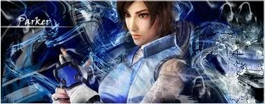
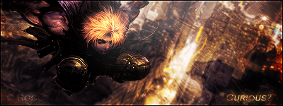
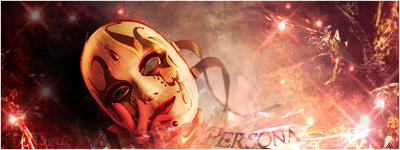
2nd one the best Id say. You need to work on lighting though and tone down the lightness and contrast  |
|
|
|
Post by R Ø G U € » on Feb 6, 2008 19:04:59 GMT -5
They're differn't, that's for sure. The backgrounds look cool, but the lighting, blending, depth, and color coordination need a lot of work... I can elaborate more if you want, but I think you see what I'm talking about. Other than that... Not too bad. |
|
Edwards
 Aka: Brian Silver
Posts: 3,037
|
Post by Edwards on Feb 6, 2008 20:28:59 GMT -5
They're extremely bright, and the first one is quite large. I defiantly like the idea behind it, just needs work to back it up.
|
|